Long before neon billboards and endless digital pop ups, people were charmed by printed posters and magazine spreads that turned simple products into miracles. A single page could convince a reader that soap would bring elegance, that a new car would change family life, or that a cigarette would make them the envy of the room.
These ads sold products while offering visions of better lives, daring futures, and smaller escapes from the ordinary. In those carefully crafted designs we can see the heartbeat of entire decades.

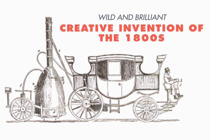
The Age of Wonders in Print
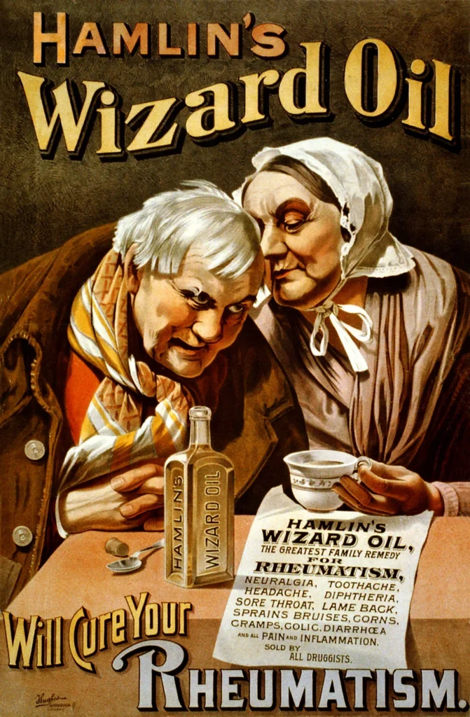
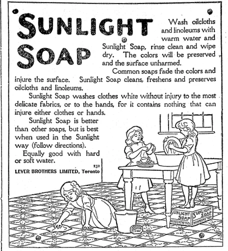
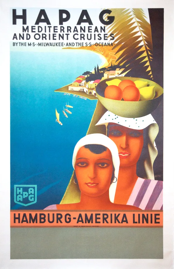
Step back to the late nineteenth century, when advertising first began to leap from plain announcements to bold art. Victorian and Edwardian posters filled with intricate borders and rich hand drawn figures promised elixirs that could cure every illness, or soaps that could turn working hands into those of nobility.
The text wrapped itself around beautiful illustrations that often included exotic backdrops, because mystery sold well in an age of exploration and empire. Looking at them now, the charm lies in how sincerely they believed in the product’s magic.
In this world of illustrated promise, a simple cake of soap or a bottle of tonic became more than a household item. It became a story that made people believe they were participating in progress and refinement. The faces in these ads smile from a time when printed paper was the strongest bridge between dream and purchase.
Modernity on the Page
When the roaring twenties arrived, the ads took on the energy of a jazz tune. Art Deco shapes, bold color blocks, and sleek fonts gave birth to a look that felt as fast as the new automobiles rolling off assembly lines.
Air travel was still new, radios hummed in the corners of homes, and ads captured that thrill with futuristic angles and confident smiles. A lipstick ad could feature a flapper in shimmering silver, while an airline poster might show an entire world unfolding beneath a plane’s shadow.
The thirties added a subtle tone of escapism. During hard economic times, ads offered a touch of glamour for the price of a bottle or a bar of soap. A toothpaste campaign might show radiant film stars whose smiles promised romance and luck. A hotel ad might use warm watercolor illustrations to let viewers dream of distant coasts.
Posters that Served and Persuaded
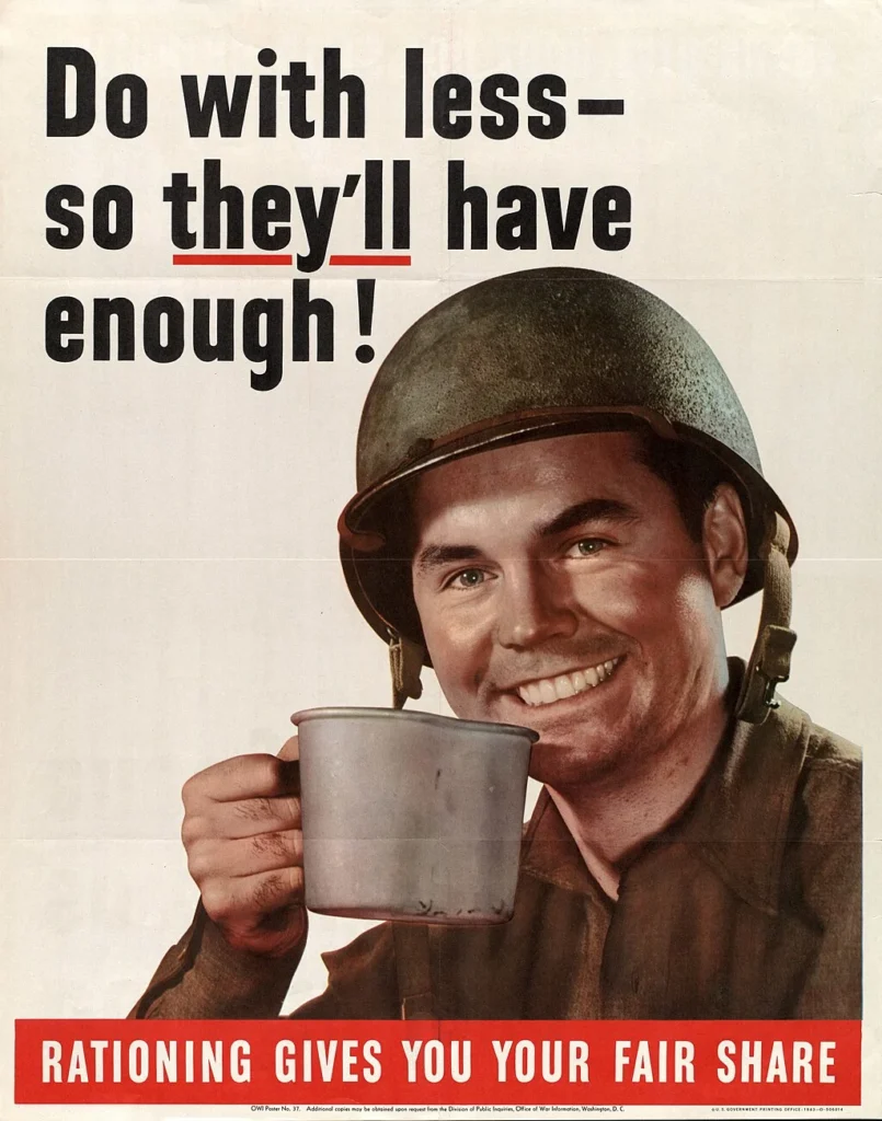
The forties carried the urgency of a world at war. Government posters became some of the most memorable images of that time, urging people to save scraps of metal, grow victory gardens, and buy war bonds.
Rosie the Riveter gazed out with rolled sleeves and confident eyes, a symbol of strength and pride that doubled as encouragement to join the workforce. Every ad became more than a sales pitch, it became part of a shared national effort.

Civilian products were still advertised, but even those were tinted by the reality of wartime. A coffee brand would boast of helping soldiers stay awake, while an automobile company showed how its engineers contributed to building tanks. These ads preserved snapshots of how ordinary life bent and adapted under extraordinary circumstances.
Domestic Dreams and Mid Century Confidence
The fifties emerged with an explosion of color, optimism, and a very specific vision of domestic life. A new fridge meant a happier home, a new car meant a better family holiday, and a certain brand of bread meant children would grow strong and cheerful.
The ads spoke boldly with block lettering and bright illustrations that jumped off the page. Women in perfect dresses held sparkling appliances, while men in sharp suits admired new cars that gleamed like polished jewels.
A little step back to this amazing refrigerator advert from the 1950s… full of useful features and accessories 😍
Posted by Kesseler on Saturday, August 6, 2022
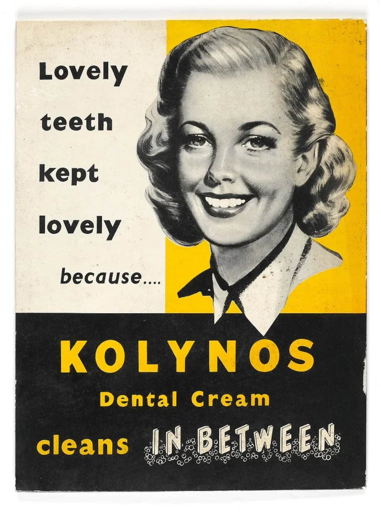
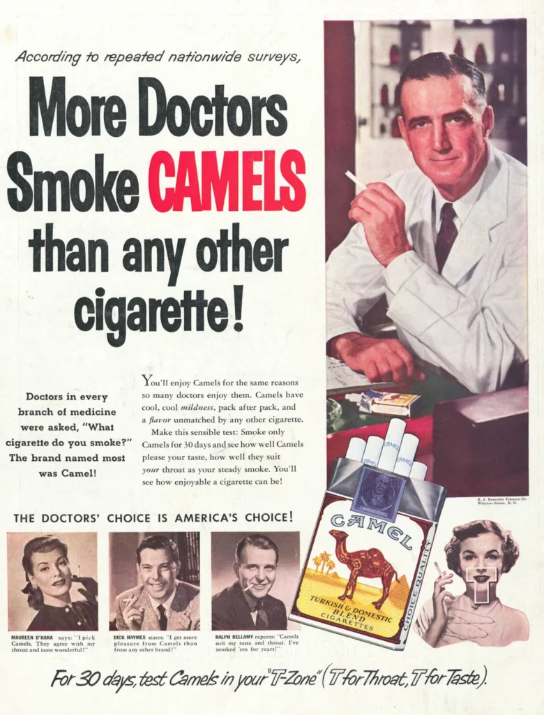
This was also the age of cigarette doctors. Some ads displayed men in white coats declaring that a particular brand was smooth and recommended. Seeing them now feels like peeking into a parallel world, one where science was used as a cheerful mascot for vice. The tone is so certain and so polished that the page almost glows with misplaced trust.
Turning Cool into Culture
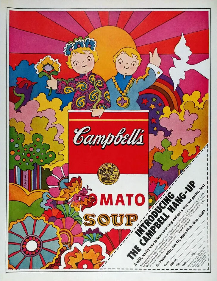
As the sixties approached, advertising began to absorb the colors and ideals of cultural change. Posters featured swirling shapes and hand lettered slogans that reflected the freedom and experimentation of the time.
A perfume ad might feel like a pop art painting, a car ad might show a beach scene with laughing friends, and a soda ad could transform into a celebration of youth and togetherness.
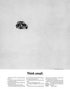
Volkswagen famously turned simplicity into genius with its small car ad that invited people to “Think Small” and celebrated practicality in a culture addicted to size. The humor and humility of that ad made it legendary, and it remains a reference point for how clever design can redefine an entire brand.
A Burst of Bold and Brave Choices
The seventies blended earthy tones with bold patterns, giving ads a warm and experimental feel. Travel posters featured sunsets in rich oranges and browns, while clothing ads embraced free spirited poses and flowing garments. Technology began to creep in with ads for home stereos and color televisions that promised to bring the entire world into your living room.
The tone of the decade encouraged individuality. A jeans ad might show people dancing barefoot in a meadow, while a soft drink campaign might celebrate shared moments at music festivals. Every page carried a touch of rebellion wrapped in a friendly smile, a balance that feels striking even today.
When the Future Knocked on the Door
The eighties were bright and brash, and advertising embraced neon lights and futuristic fonts. Technology took center stage with computers, video game consoles, and early mobile phones. Perfume campaigns grew cinematic with dramatic shadows and shimmering gowns. Music videos and magazine ads merged into a single visual language that felt endless in energy.
Corporate brands learned to sell a lifestyle rather than just a product. Nike posters invited people to chase greatness. Sony showed smiling families gathered around glowing screens. Pepsi campaigns paired bold colors with pop stars in leather jackets. The world was moving fast, and the ads raced to keep up.
Spike Lee. Michael Jordan. Sneakers. Studio shots. This 1980s advertisement is an example of Nike’s marketing strategy to use riveting portraits of athletes. #Archives80s
— National Museum of American History (@amhistorymuseum) August 8, 2018
[👟: Nike Advertising Oral History and Documentation Collection, Archives Center] pic.twitter.com/kuHgIOQzkK
Why These Ads Still Speak
Looking at these ads today is like leafing through a visual diary of human hopes and habits. Each one tells a small story about what people valued, feared, or longed for in its moment. The fonts, the illustrations, the grand promises all hold a mirror to the way life once felt. What makes them iconic is the design and the glimpse they give into everyday dreams.
These images remind us that advertising sold products while reflecting a version of life that felt reachable yet elevated. They were pictures that carried promises made in ink and imagination, promises that still charm us as we look back.